American Museum of Ceramic Art
Brand Identity ︎︎︎
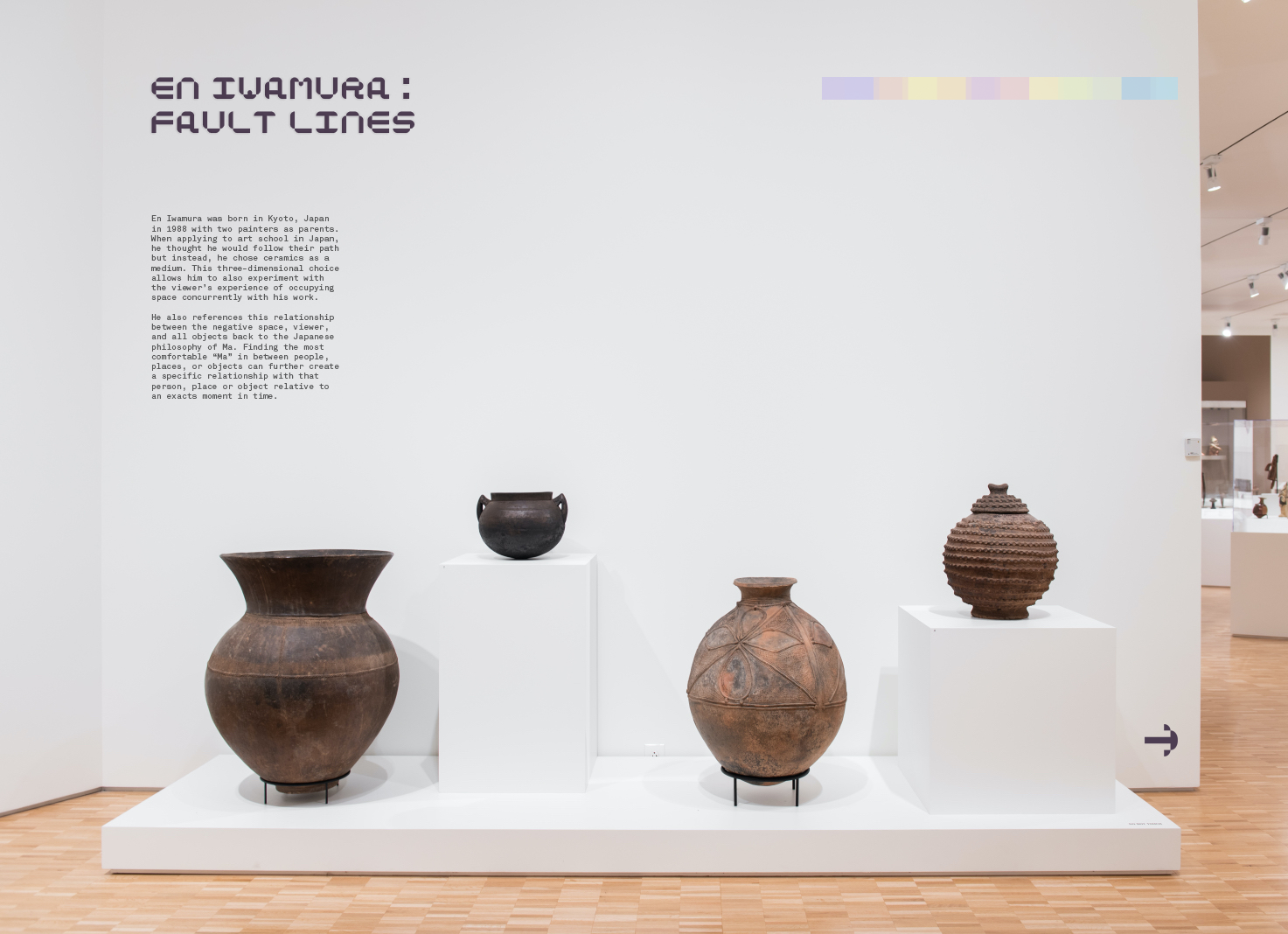
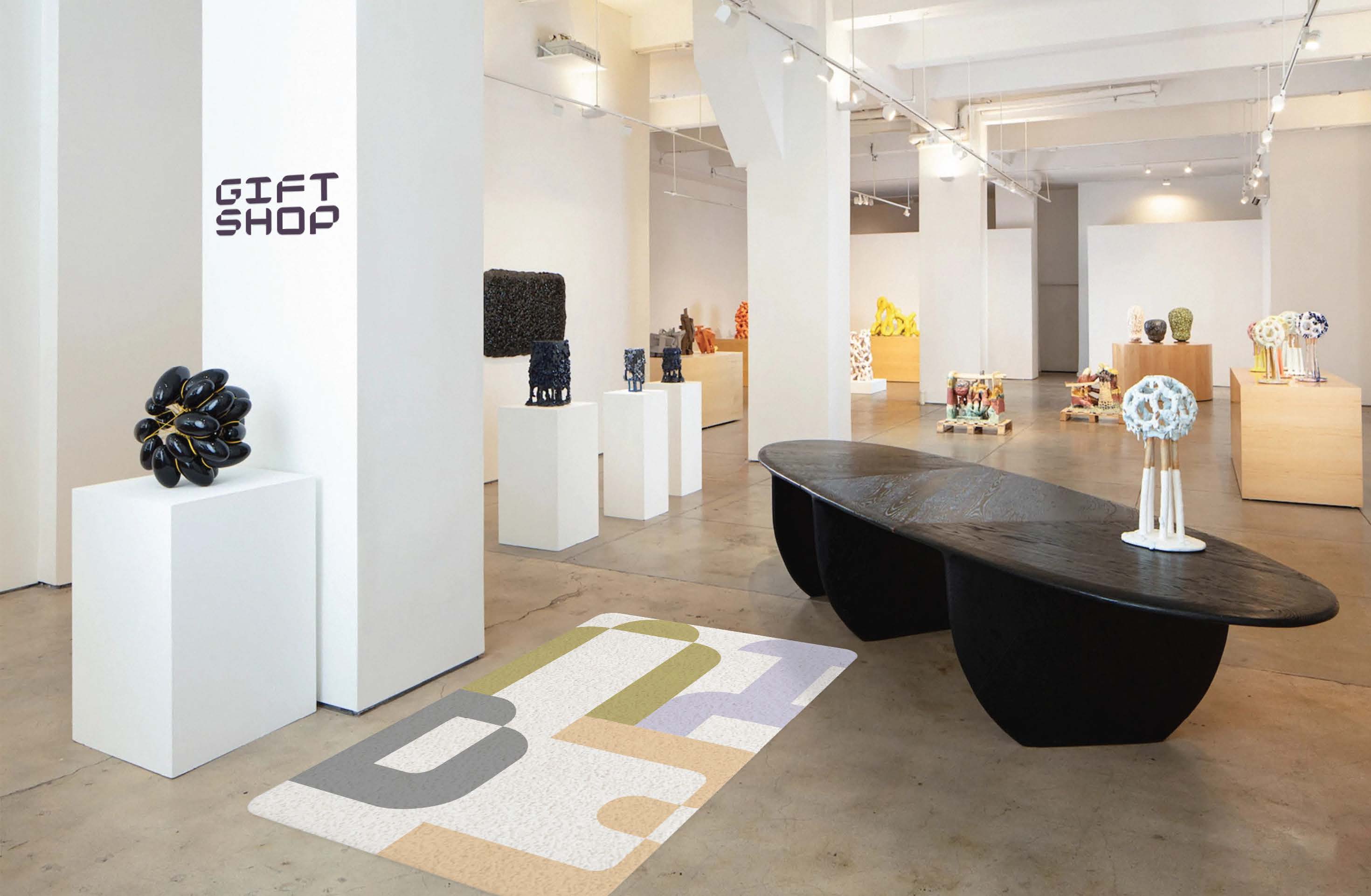
Now more than ever, museums require a sense of community involvement to foster dialogue and build stronger connections among the people around us. The rebranding of the American Museum of Ceramic Art is designed to inspire newcomers to engage in the hands-on process of creating ceramic art by highlighting the importance of the creative journey and the ceramic studio within the museum.
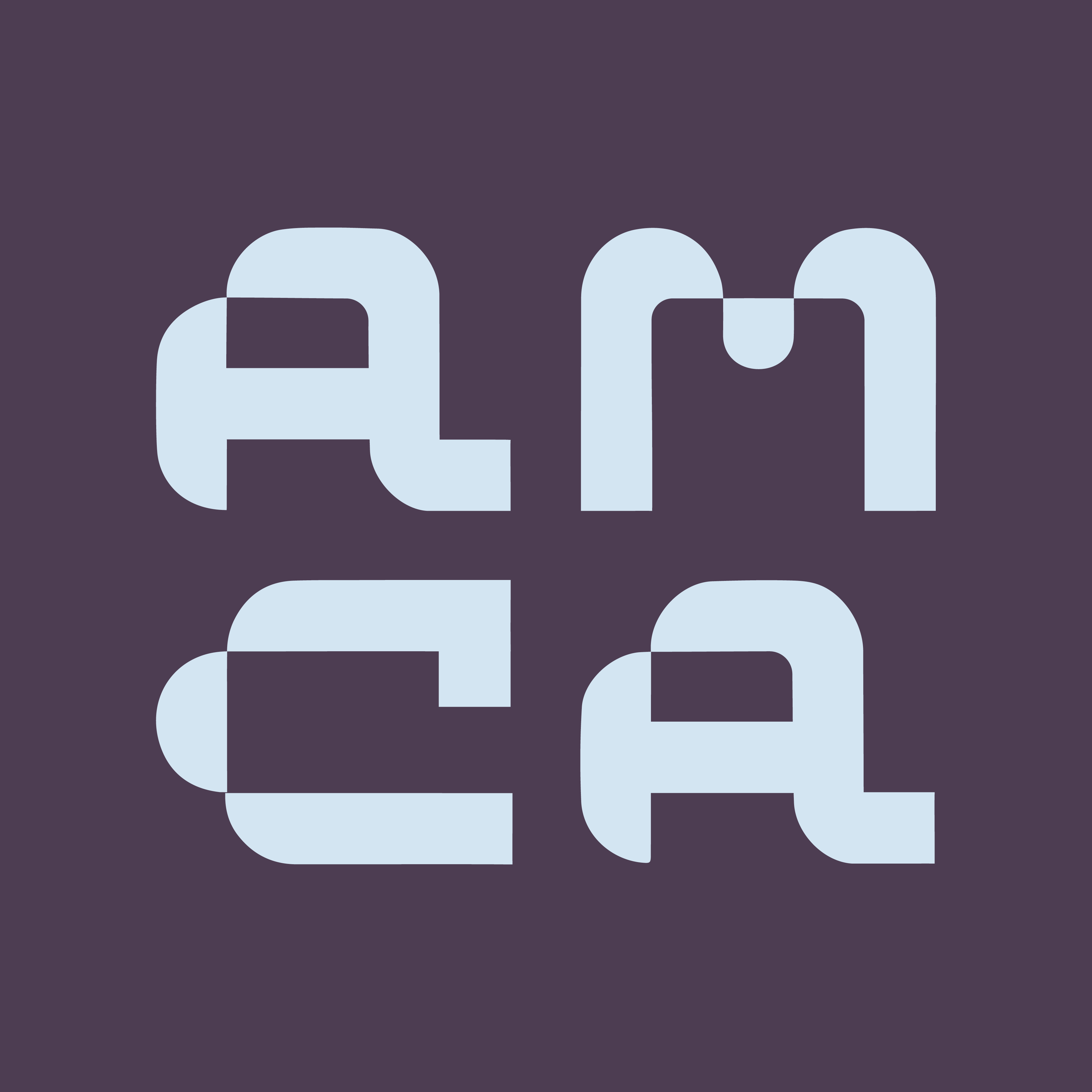
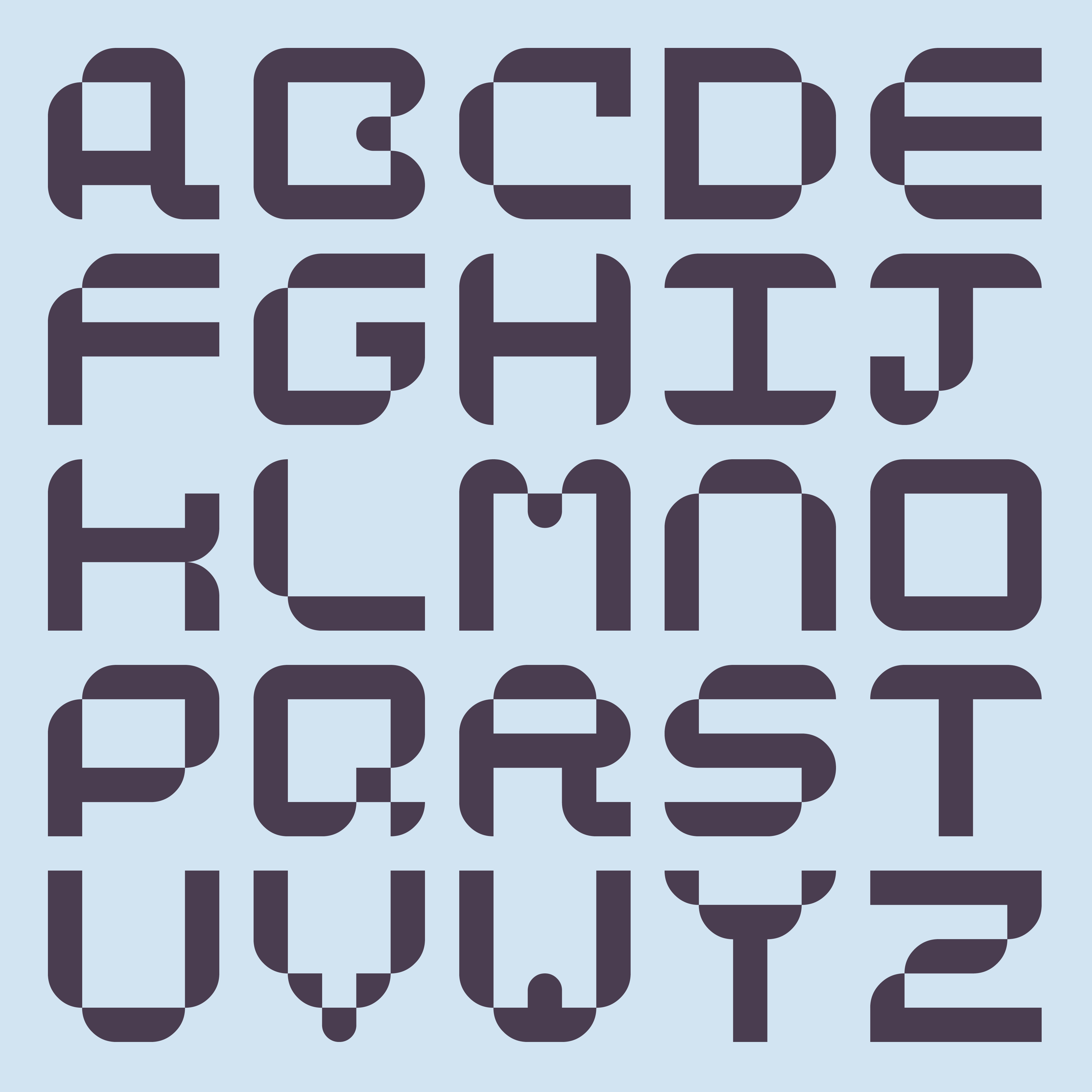
The logo and custom typeface represent the contrast between the malleability of clay and the enduring nature of ceramics through the corners curving into the letterform.


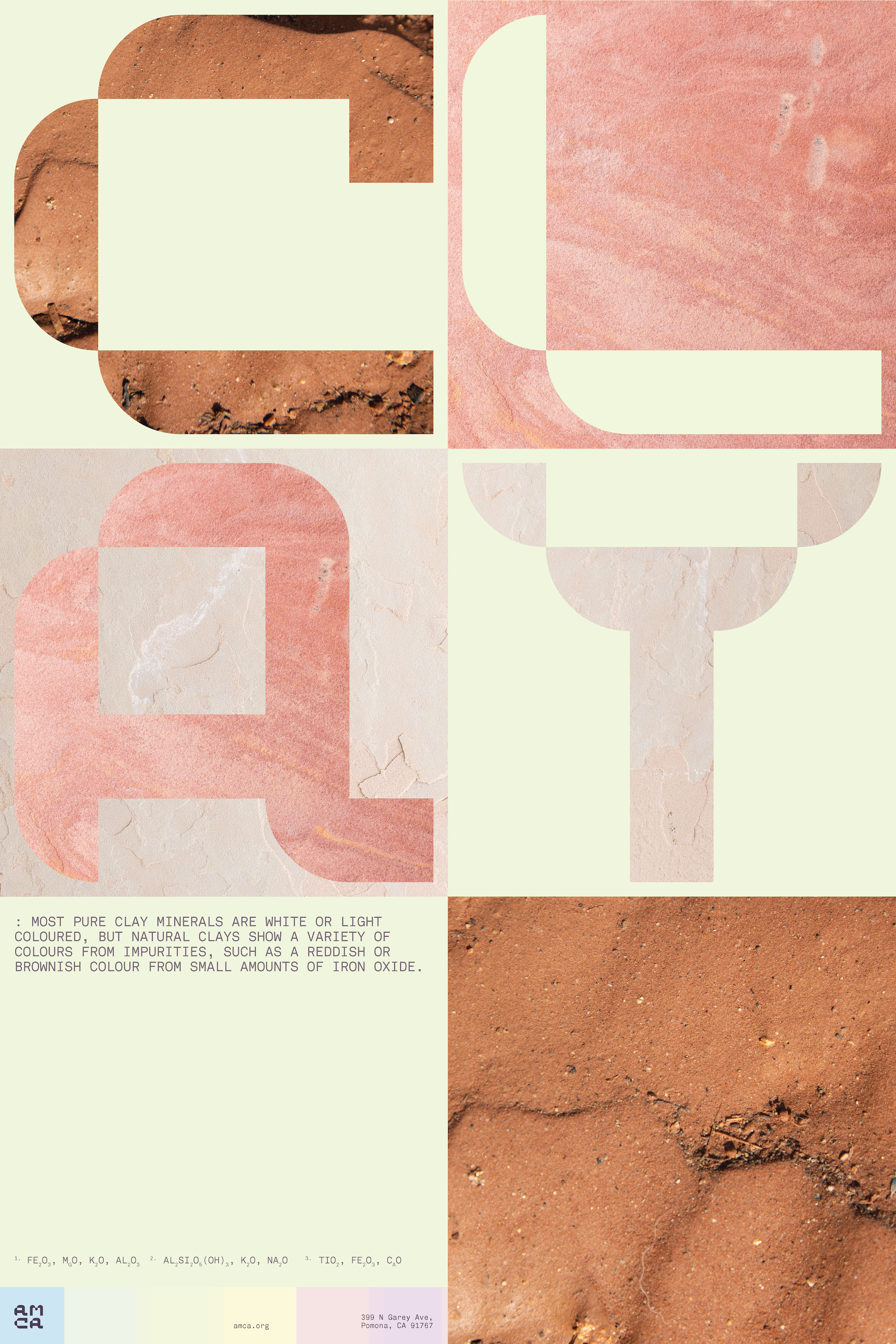
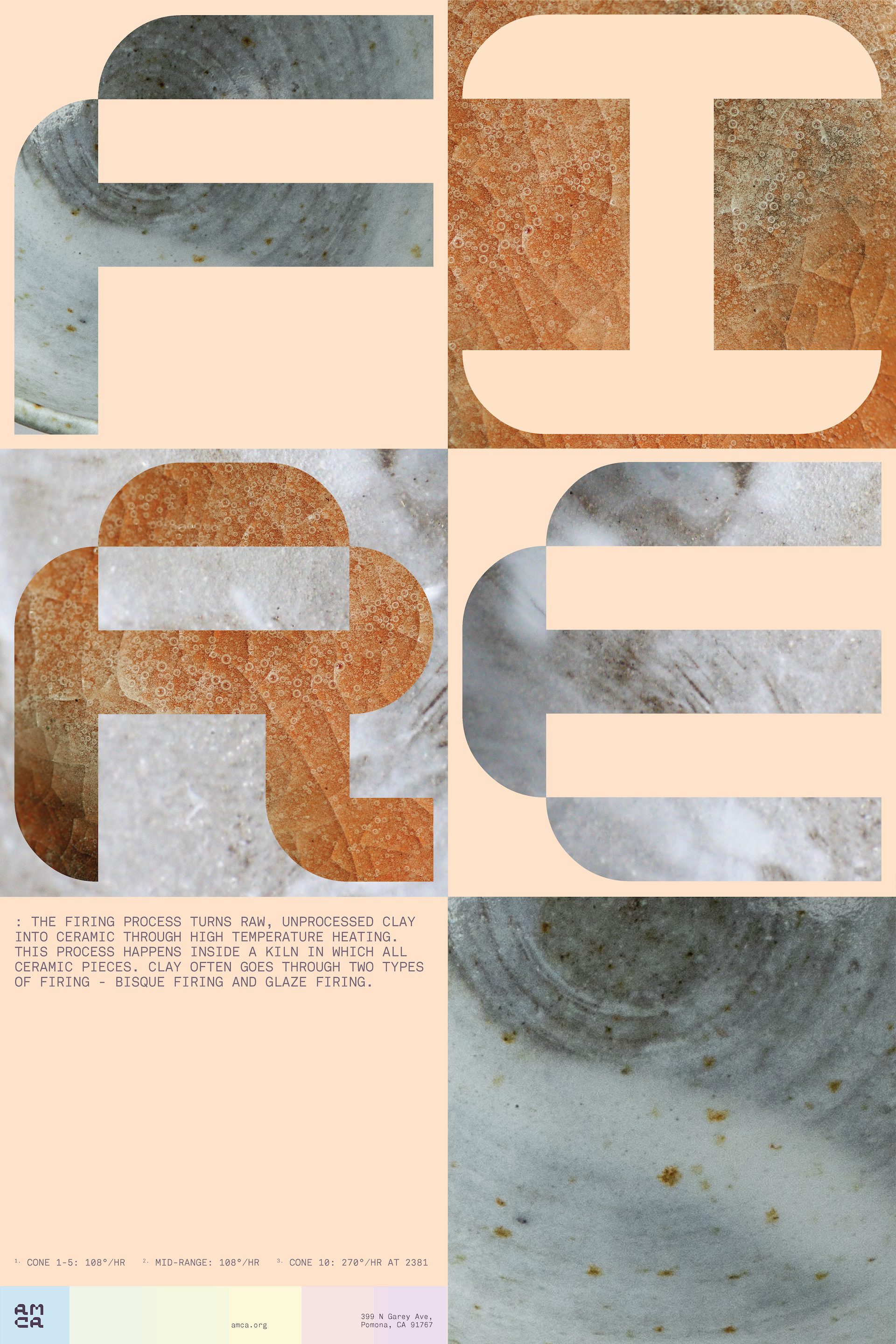

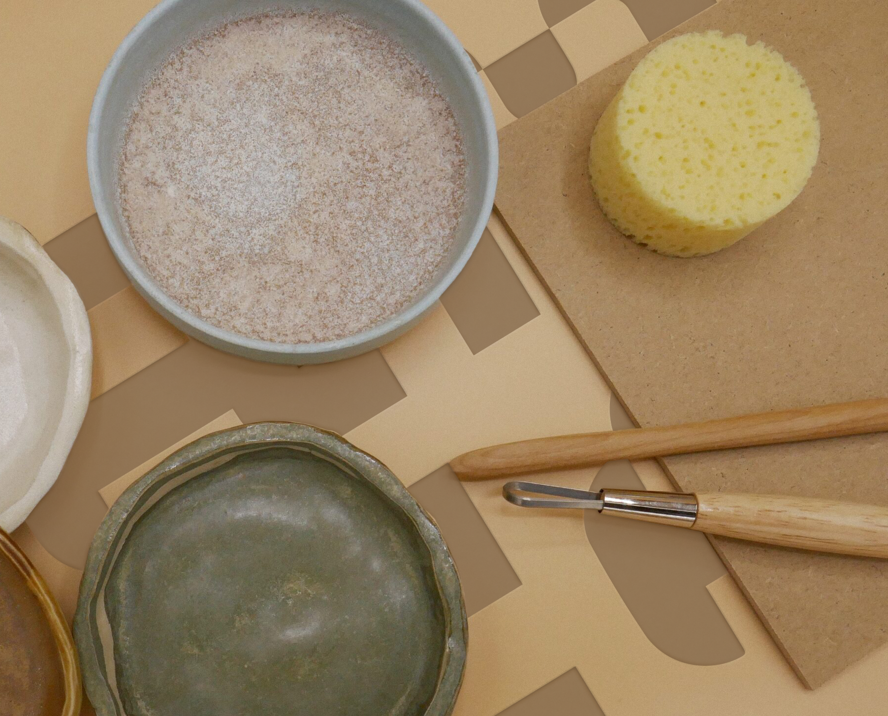
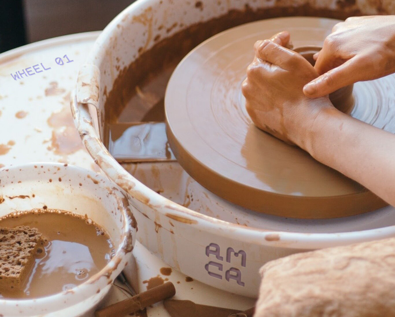
The posters feature macro images showcasing the ceramics-making process, including the grain of the clay, the malleability during shaping, and the reflective glazes during firing.





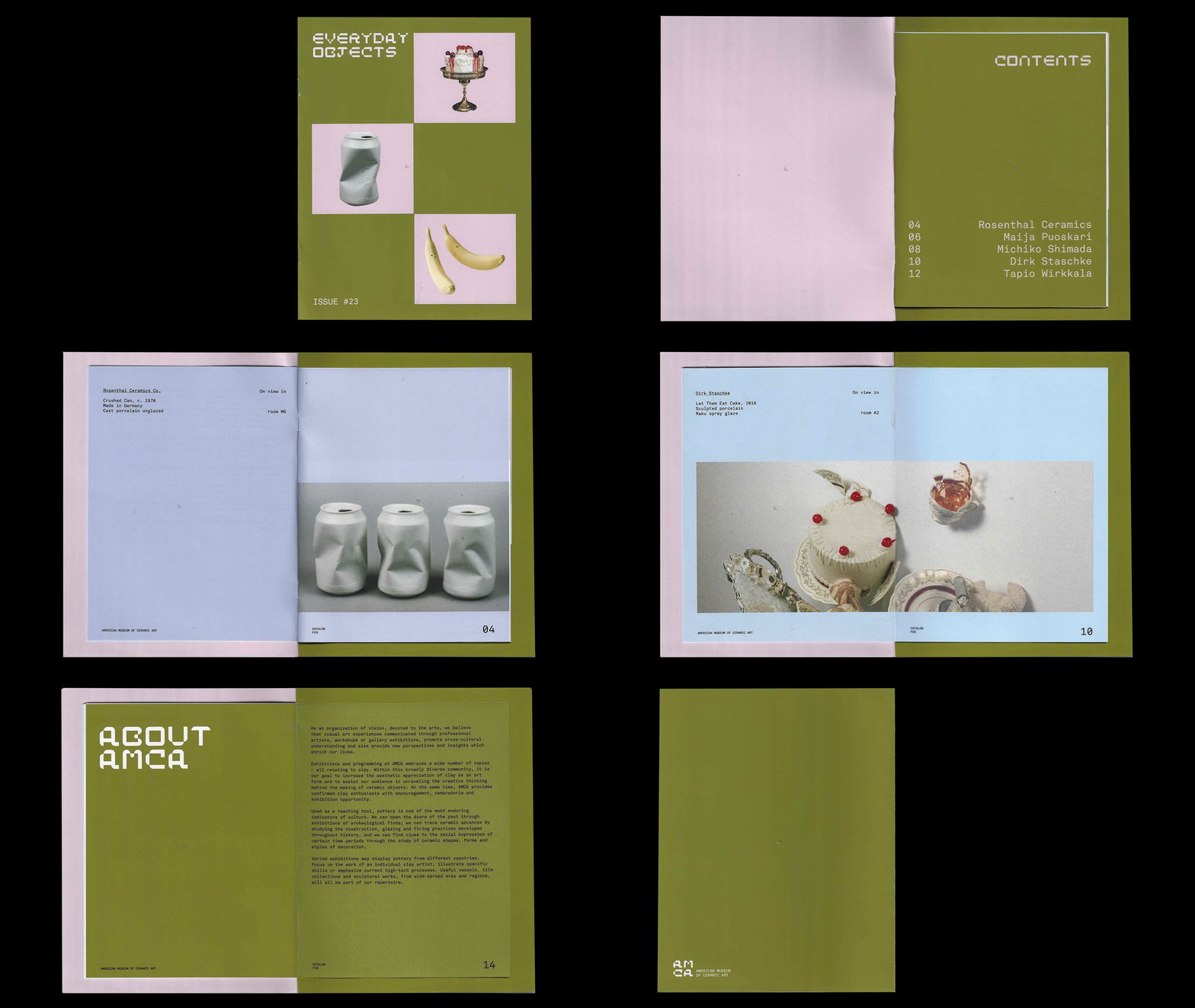
The catalog for the museum exhibition highlights the use of everyday objects in ceramic art, celebrating the beauty found in the commonplace. The size of the pages inside have been reduced by 18% to symbolize the shrinkage that ceramic art undergoes when fired in a kiln.
Play Clay Camp
The proposed initiative for the museum is a clay camp aimed at children, with a visual aesthetic that evokes the nostalgic feel of Play-Doh, using 3D rendered typography.
![]()
![]()
![]()
![]()


The site features a draw function in the home page, allowing parents and kids to play with a 3D clay brush. The interactivity between the site and user allows the audience to get excited about creating.


