Pio Pico Library
Brand Identity ︎︎︎
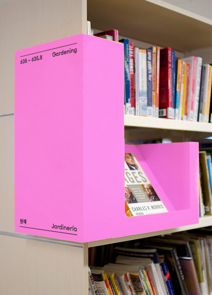
Located in the intersection between multiple communities in Koreatown, the Pio Pico Library serves as a valuable resource hub for a diverse range of individuals. The implementation of linear rules in the library's rebrand serves to organize the three key communities and languages featured within the space.
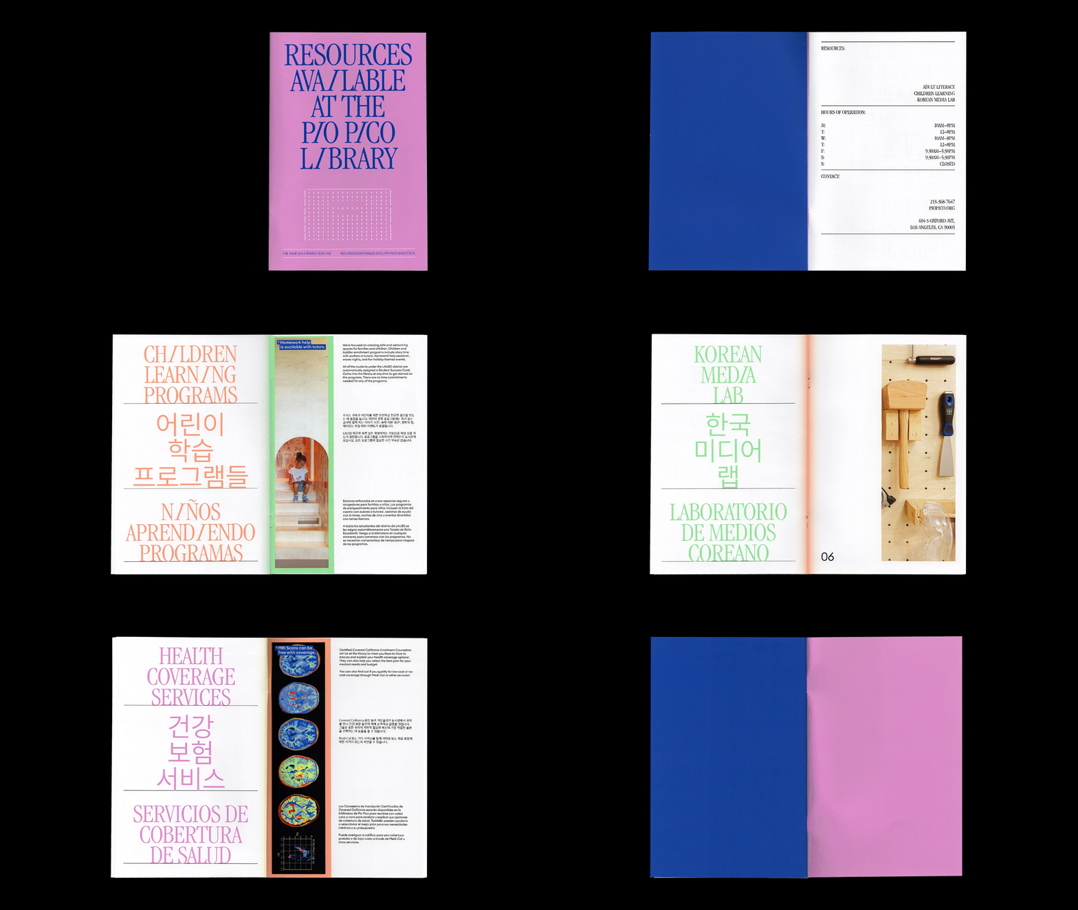
Trilingual booklet on the resources available at Pio Pico. Bookmarks embedded within the page that you can rip off and utilize in your books.


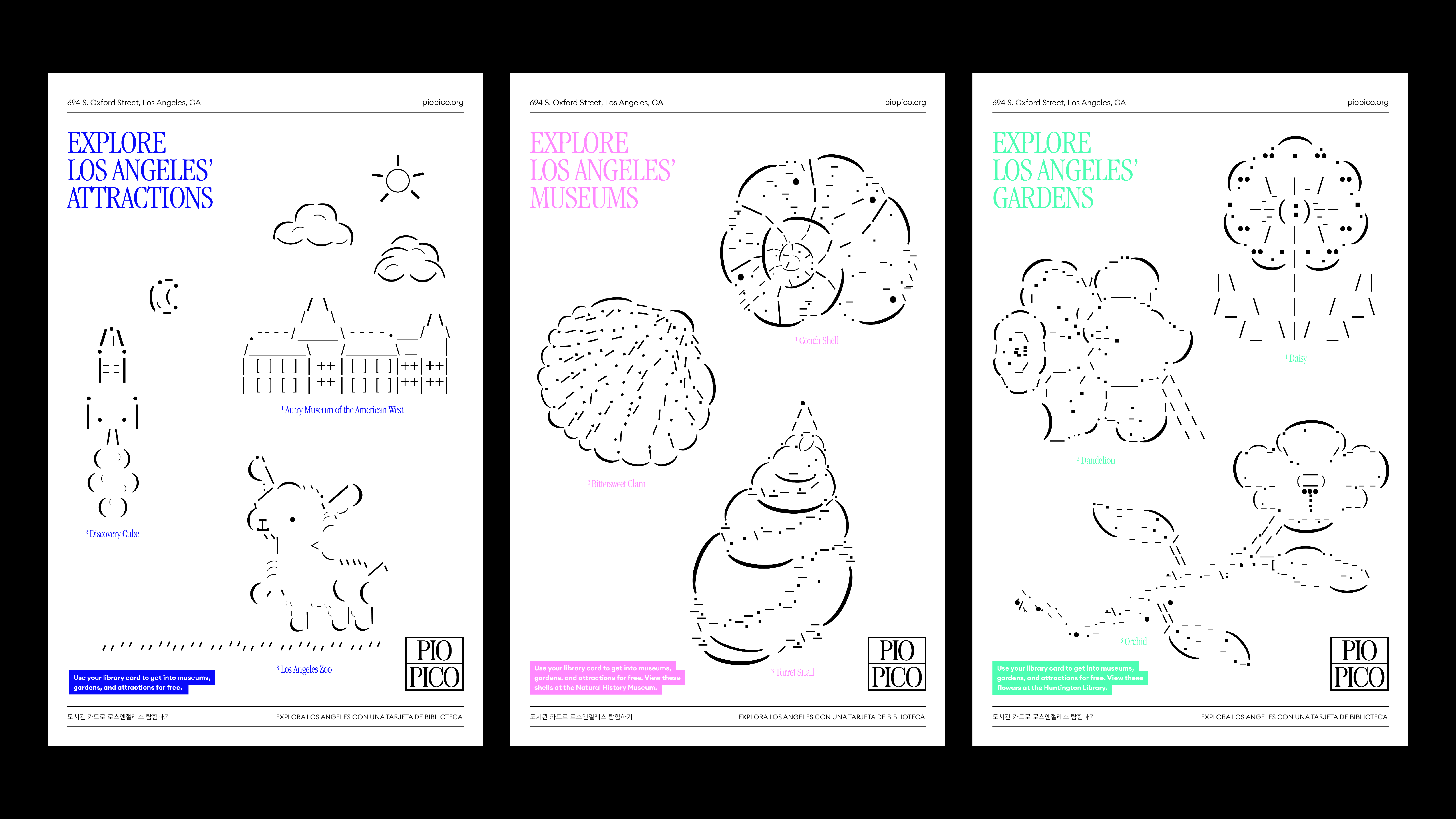
The posters aim to encourage community members to utilize the library's resources and engage with its services. To promote accessibility for a wider audience, the posters feature information in multiple languages. The choice of colors draws inspiration from highlighter pens, emphasizing information and bringing a bolder look to the library.
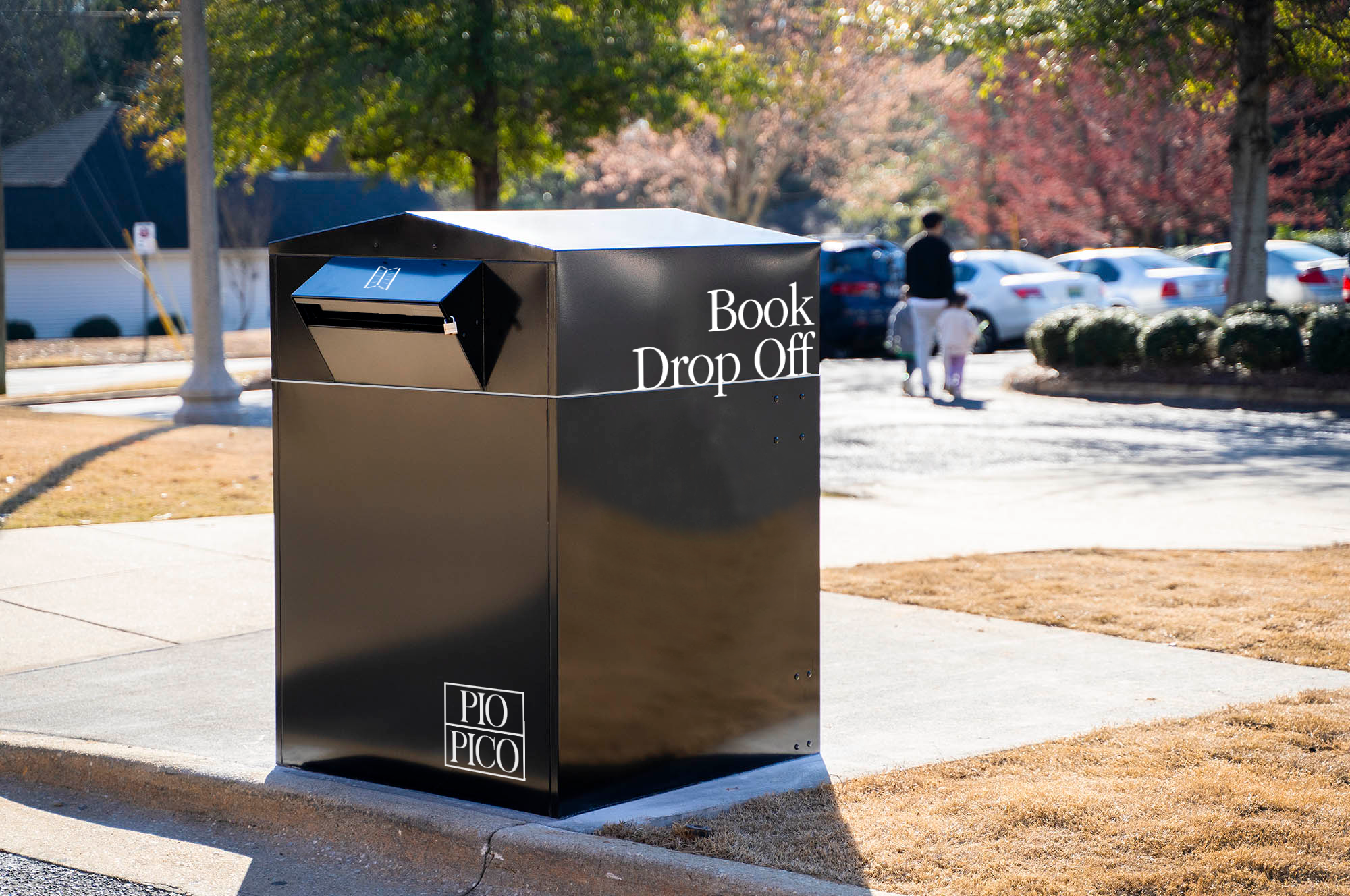





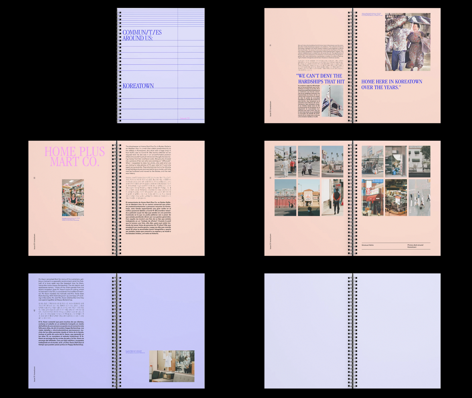
To foster a great sense of community, I created a guidebook to local businesses in Koreatown, encouraging the community to discover and support them.
Pio Pico Library-Explore LA Campaign
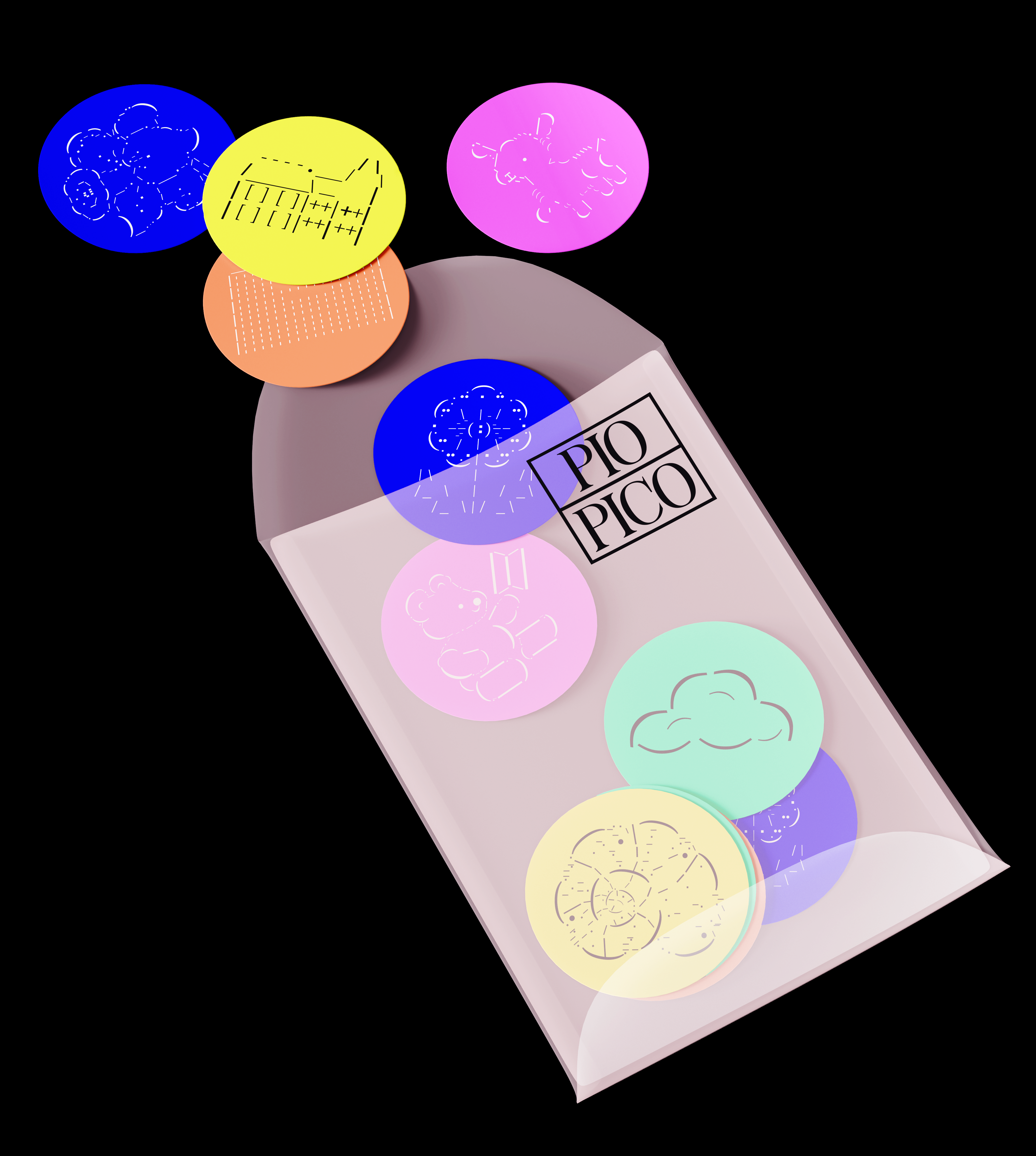
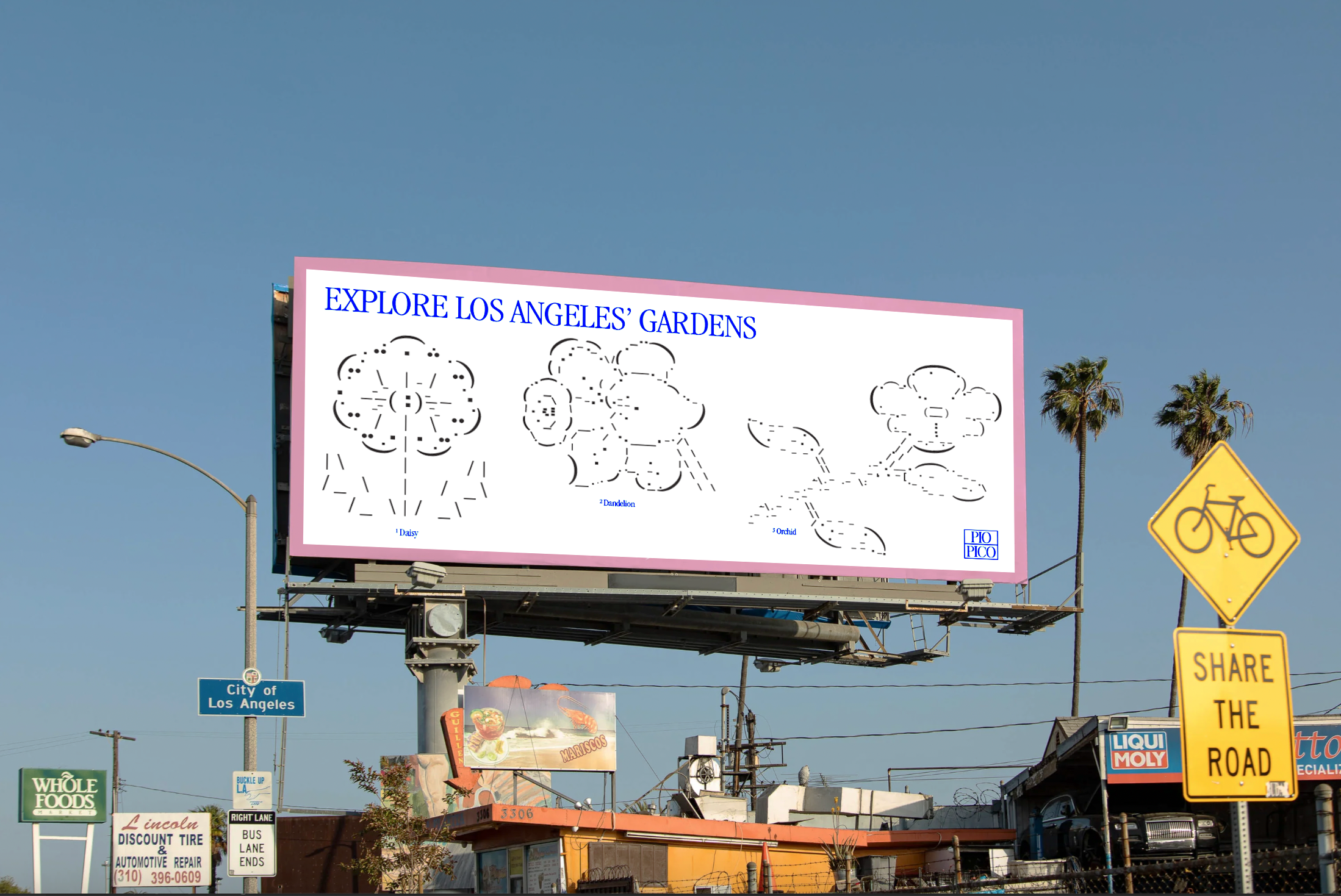
The hypothetical campaign for the library is "Explore LA," which encourages the general public to obtain library cards to gain free admission to a multitude of museums and attractions. Given that glyphs are present in virtually every language, I used them within the illustrations for the campaign to make it recognizable for a wide audience.
